B&O
Wall Clock
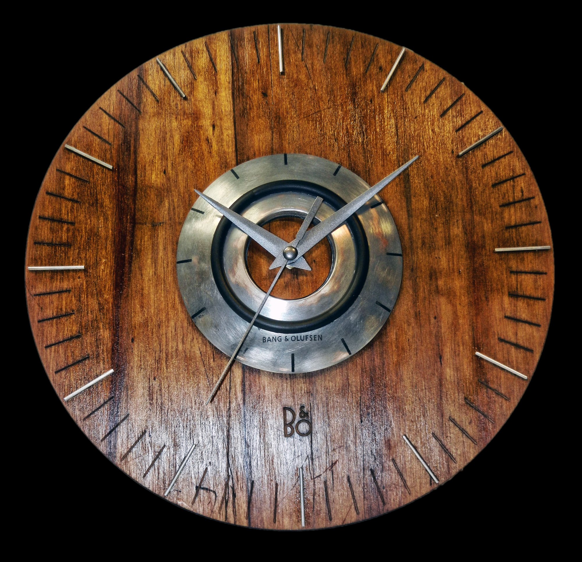
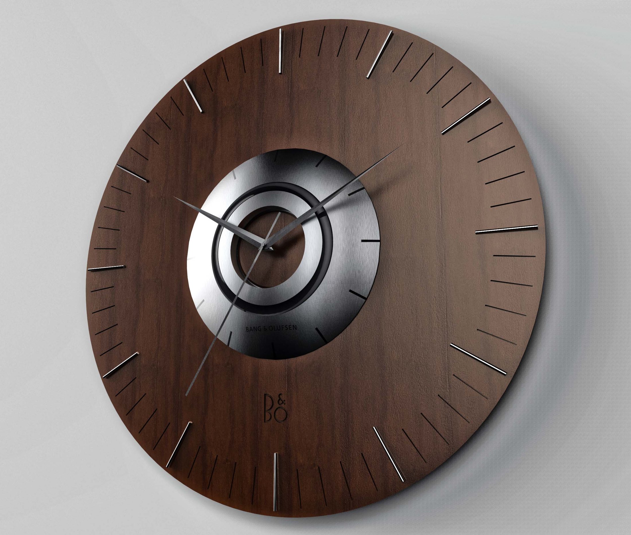
A wall clock drawn in the Bang & Olufsen language — noble materials, an inverted speaker-cone at its heart, reduced to the essential.
An object
for the most demanding ear
The course brief was to design within an existing brand's language. I chose Bang & Olufsen — a brand that answers to the strictest users, built on synthesis but always led by aesthetics.
The intended owner is the audiophile and the musician: a person whose hearing is finely tuned, surrounded every day by materials familiar to the ear and the hand. Wood is imperative — it's the material of speakers, guitars, drums and pianos — so it anchors the piece. The metal of the hands and the hour ring echoes the strings and electronics of instruments, and the machined-metal centre with its elastomer ring is a deliberate reminiscence of an inverted speaker cone.
An academic project for the Gráfica de Productos course — a brand-language exercise, not affiliated with or endorsed by Bang & Olufsen.
Three words sit under everything Bang & Olufsen makes, and they set the bar for this piece: an uncompromising standard in materials and process, paired with the simplest possible graphic resolution.
Every decision on the clock was measured against them — nothing decorative, nothing approximate, only what the object needs to be honest and desirable at once.
Noble materials,
precise processes
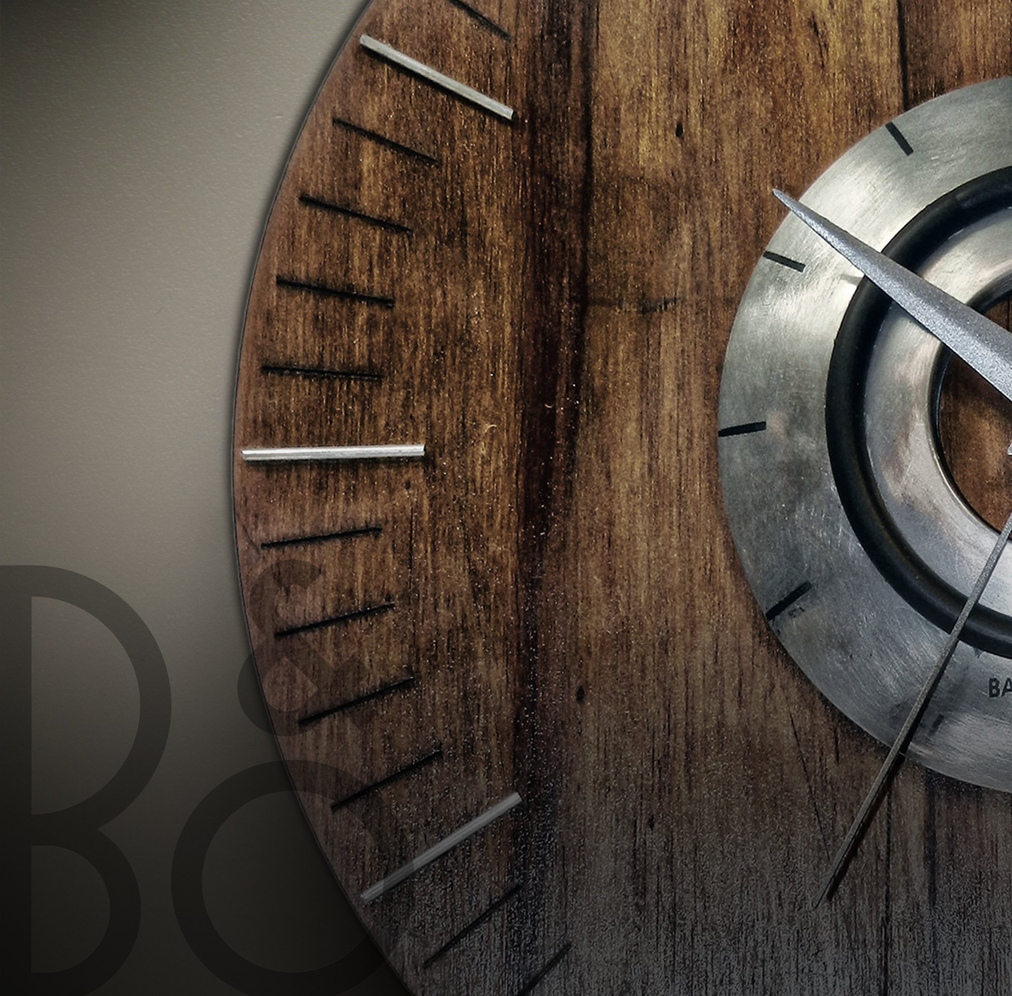
Noble materials — wood, aluminium, steel — are an emblem of the brand, and so are the most precise processes available: laser cutting and engraving, and zamak injection.
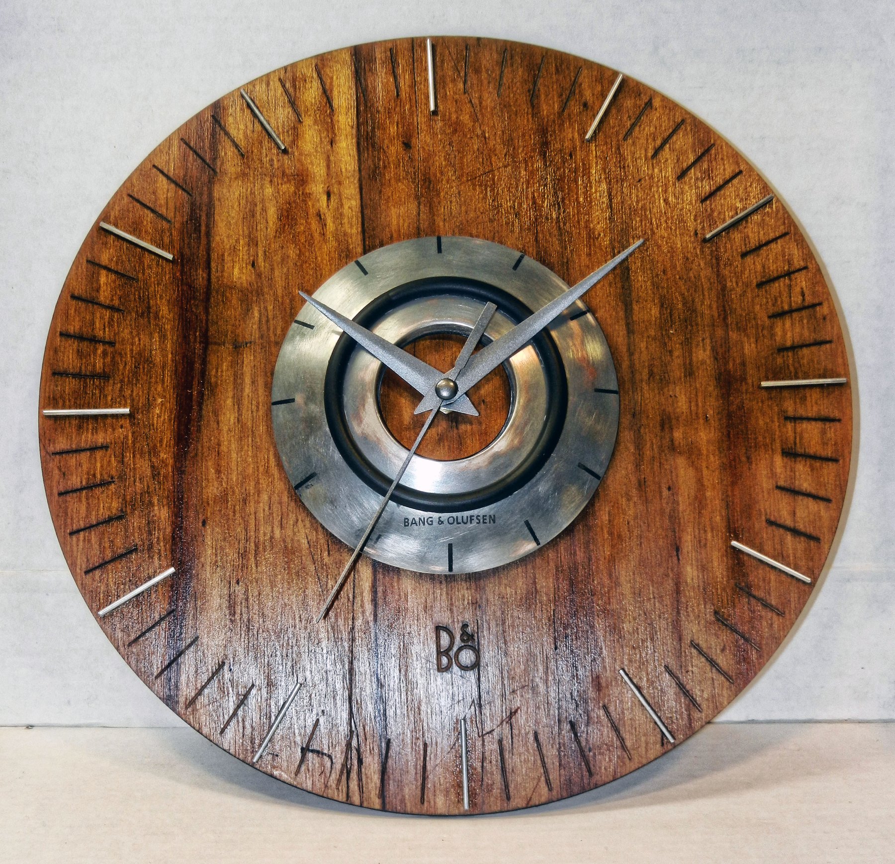
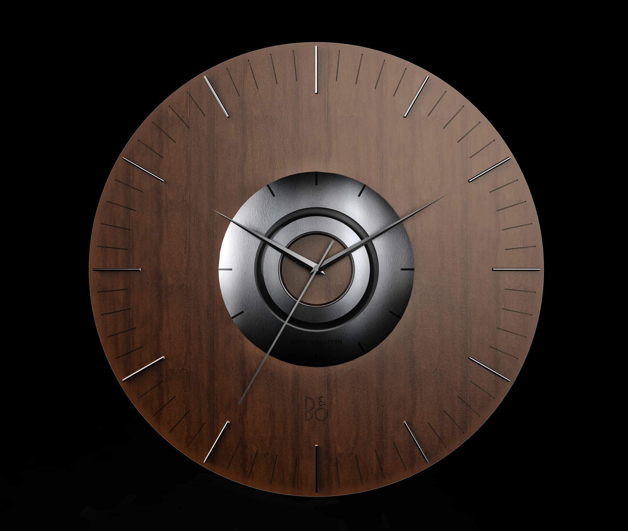
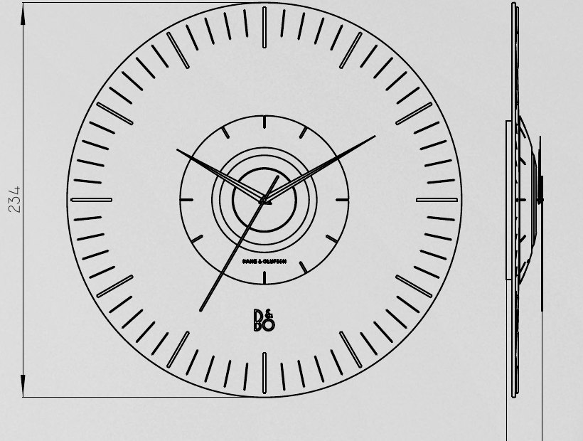
The piece is built around an injected-zamak centre, laser-engraved, fixed to a dark laser-cut plywood face with details in polished steel rod. The hands are anodised aluminium. The whole reads as 234 mm of quiet wood with a single machined eye at the centre.
Rendered,
then built
The concept was taken off the screen and made — a real wood face with a machined metal centre and steel-rod markers, where grain, wear and reflection do what no render can fully predict.