IDMR / Brand
Identity · Brand assets

The IDMR brand.

Logos, colour, typography, and clear-space rules for partners, editorial, and anyone publishing about the studio. Download SVG for any digital use and PNG for situations that can't render vectors. Anything beyond the rules below — co-branded variants, dark on light overrides, exotic placements — get in touch.

01 · Logo system

One mark. Four variants.

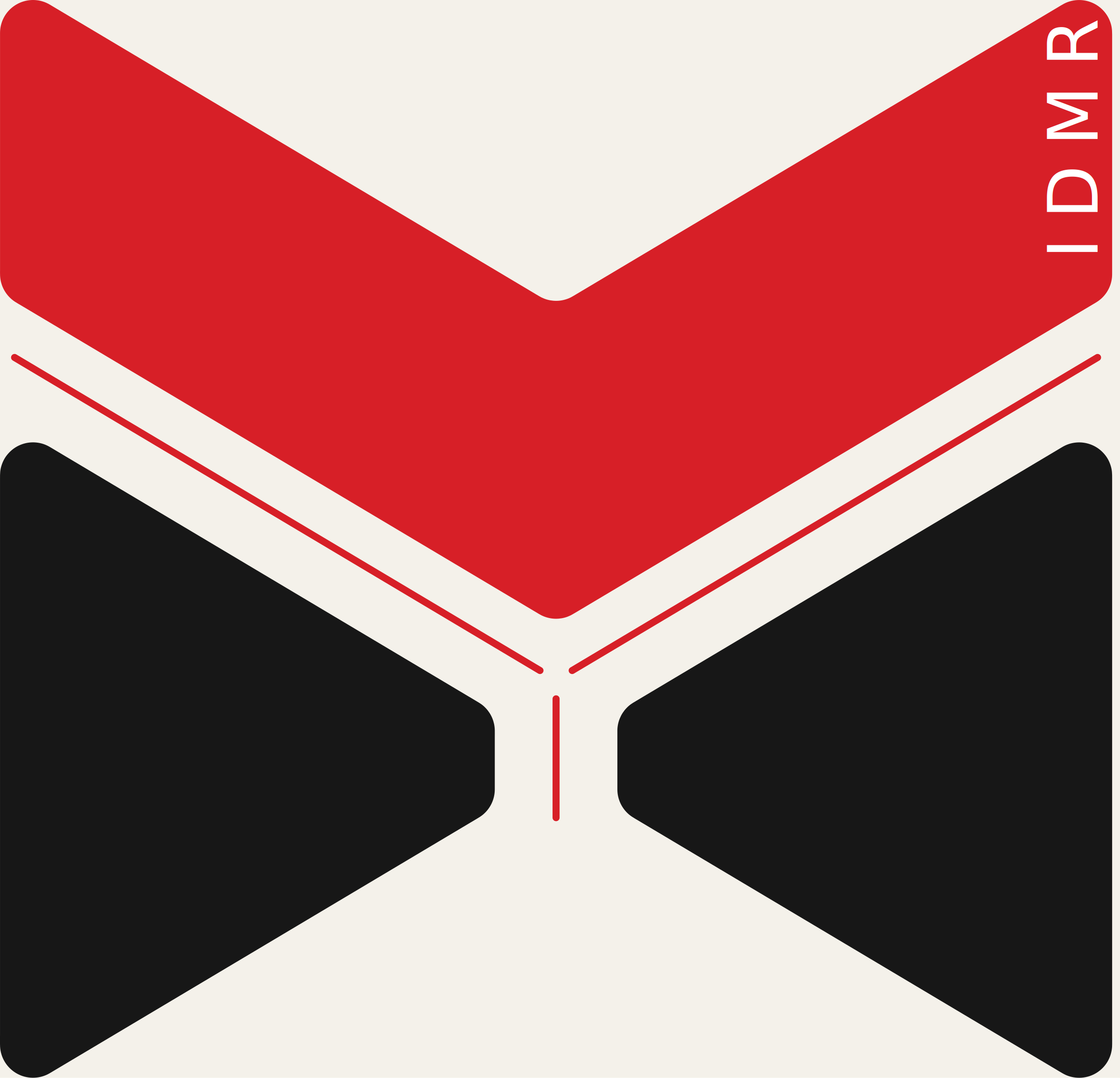
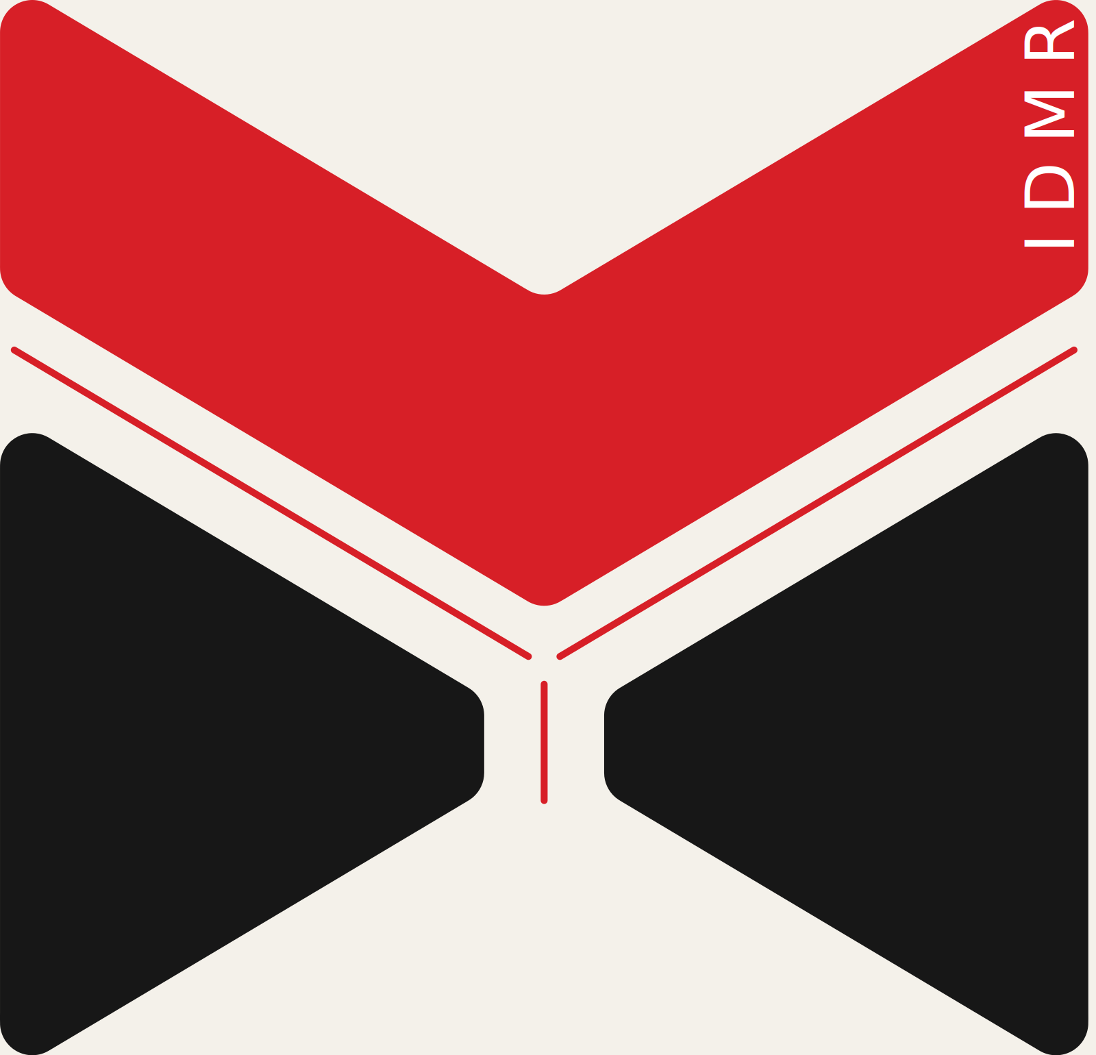
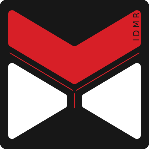
The identity is a single mark in four contextual variants. The red chevron reads as forward motion, an aerodynamic vector. Below it, two bowtie wedges form an implied "MR" — Martin Rico — anchored by a vertical hairline. The vertical IDMR wordmark runs up the chevron's right edge, replacing the need for a separate lockup with tagline.

The mark is used in four ways: on dark (red chevron + white wedges, transparent BG) for navigation and dark UI; on light (red chevron + black wedges, transparent BG) for stationery and print; primary backplate (the full master with rounded-square plate) for app icons, favicons, and avatars; and on accent (white wedges on red) for celebratory contexts.

Full logo · dark
IDMR full logo on dark
Full logo · light
IDMR full logo on light
Wordmark · dark
IDMR wordmark on dark
Wordmark · light
IDMR wordmark on light
Icon mark · dark
IDMR icon mark on dark
Icon mark · light
IDMR icon mark on light
02 · Stationery & deliverables

Print & practical.

The full identity system in production-ready form. The brand sheet is a single-page PDF reference of the system — primary lockup, color, type, and isotype variants. The business card is a 2-page print-ready PDF at 91×61 mm with 3 mm bleed and registration marks. The letterhead is A4 with header, footer, and contact strip. The email signature is HTML you can paste into any email client.

03 · Clear space

Don't crowd it.

Keep a minimum margin equal to the height of the "I" stroke (the leftmost vertical bar) around all sides of the logo. The mark is structurally dense — letterforms touch each other by design — and crowding it with other elements collapses the silhouette into noise. When in doubt, add more space.

Clear space diagram
04 · Colour

Four tones.

The palette is intentionally small. Bone is the primary text colour and ground tone for light backgrounds. Carbon is the primary background and reads as deep matte black, never pure 0,0,0. Graphite is a secondary surface tone — used for the dark blocks of the mark itself and for low-emphasis backgrounds. Signal red is reserved for emphasis, accent moments, and the chevron of the mark — never used for body text or as a flat background fill larger than a tile.

Signal red
#D71F27
Carbon
#171717
Graphite
#353535
Bone
#F4F1EA
05 · Typography

Display, body, mono.

Three typefaces for three roles. Rajdhani for display and section titles — squared geometric forms that echo the mechanical geometry of the mark, with enough character to carry headlines. Sora for body text — neutral, high-legibility at small sizes. JetBrains Mono for labels, eyebrows, technical metadata — anything where the form should signal "this is a label, not a sentence."

Display · Rajdhani · 64/72/700
Designing what moves the world.
Body · Sora · 18/300
An independent industrial & transportation design studio working at the intersection of automotive, aerospace, mobility, and industrial machinery — from first sketch to production-ready CAD.
Mono · JetBrains Mono · 14/500
01 · Brief — 02 · Concept — 03 · 3D — 04 · Visualisation
06 · Usage

A short don't list.

Don't stretch, skew, or rotate the mark. Don't recolour it outside the approved palette. Don't add drop shadows or outer glows. Don't place the mark on a busy image without a solid backplate. Don't reconstruct the mark from typed letters — it isn't a font, it's drawn geometry. Don't enlarge the icon mark beyond the size where you'd otherwise use the wordmark.

For permissions outside this list — co-branding, partner placements, editorial use cases not covered above — write to martinjrico@hotmail.com.